
Logo of the Dong Nai Department of Construction: Connectivity and Aspiration for Development
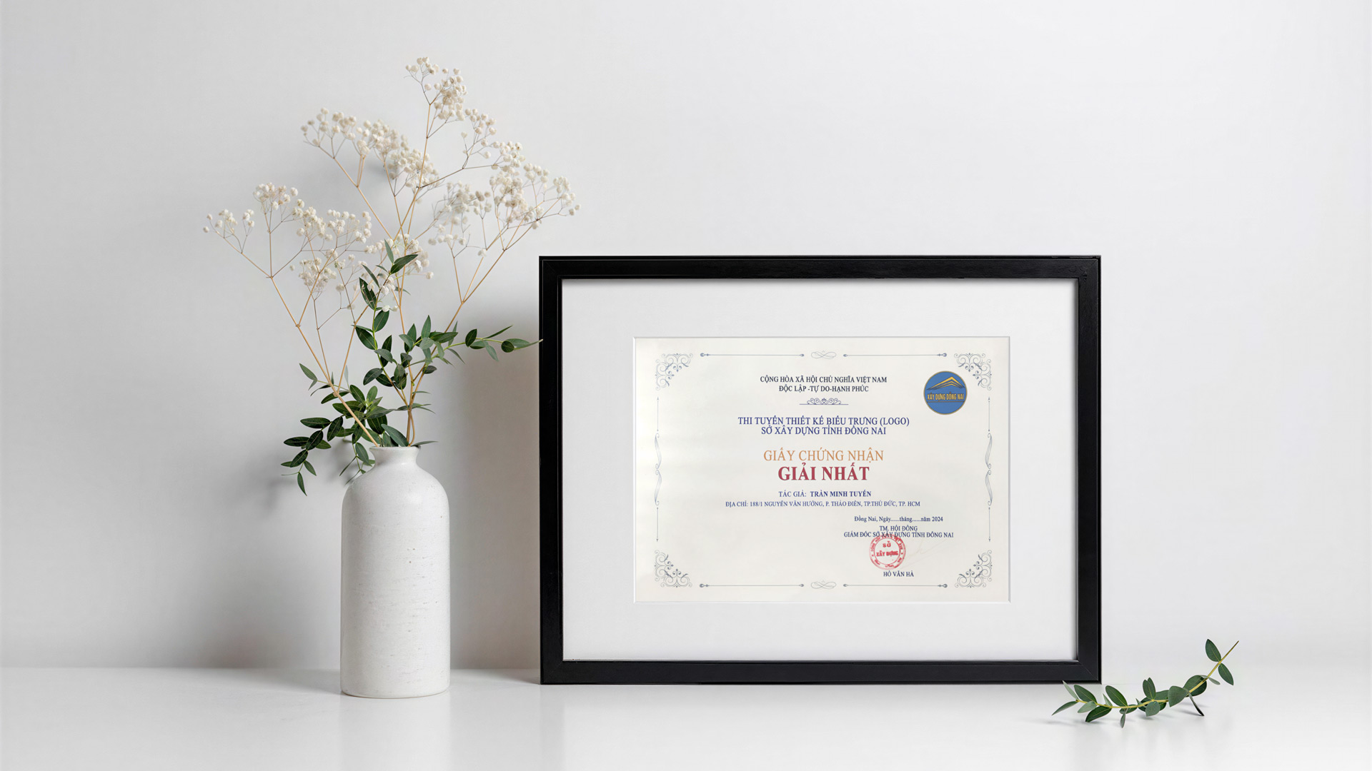
The logo of the Dong Nai Department of Construction, designed by Architect Tran Minh Tuyen, won First Prize in the design competition organized by the Department. The award ceremony took place on March 28, 2024, after the winning entry was selected from 89 submissions by designers nationwide. The award recognizes the integration of architectural thinking and graphic design language in creating a visual identity for a specialized government agency.
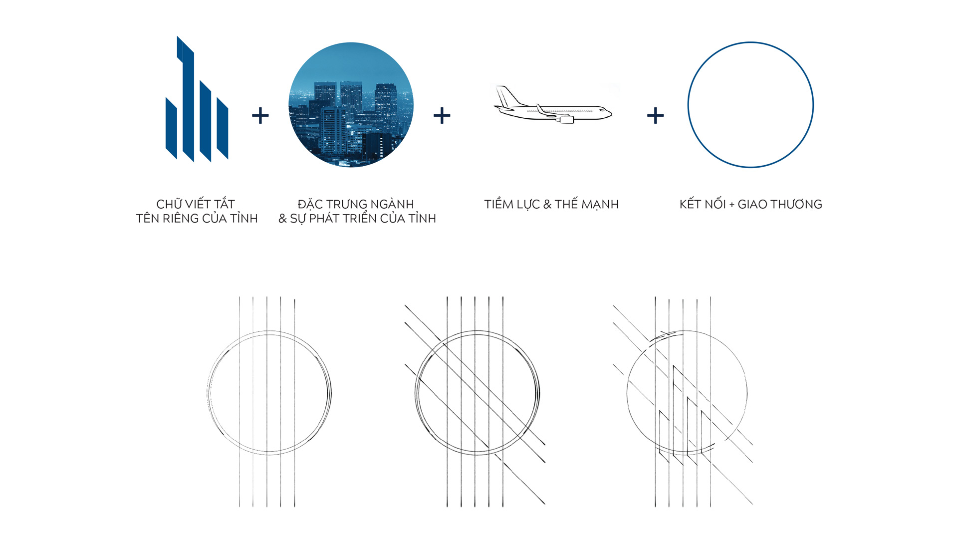
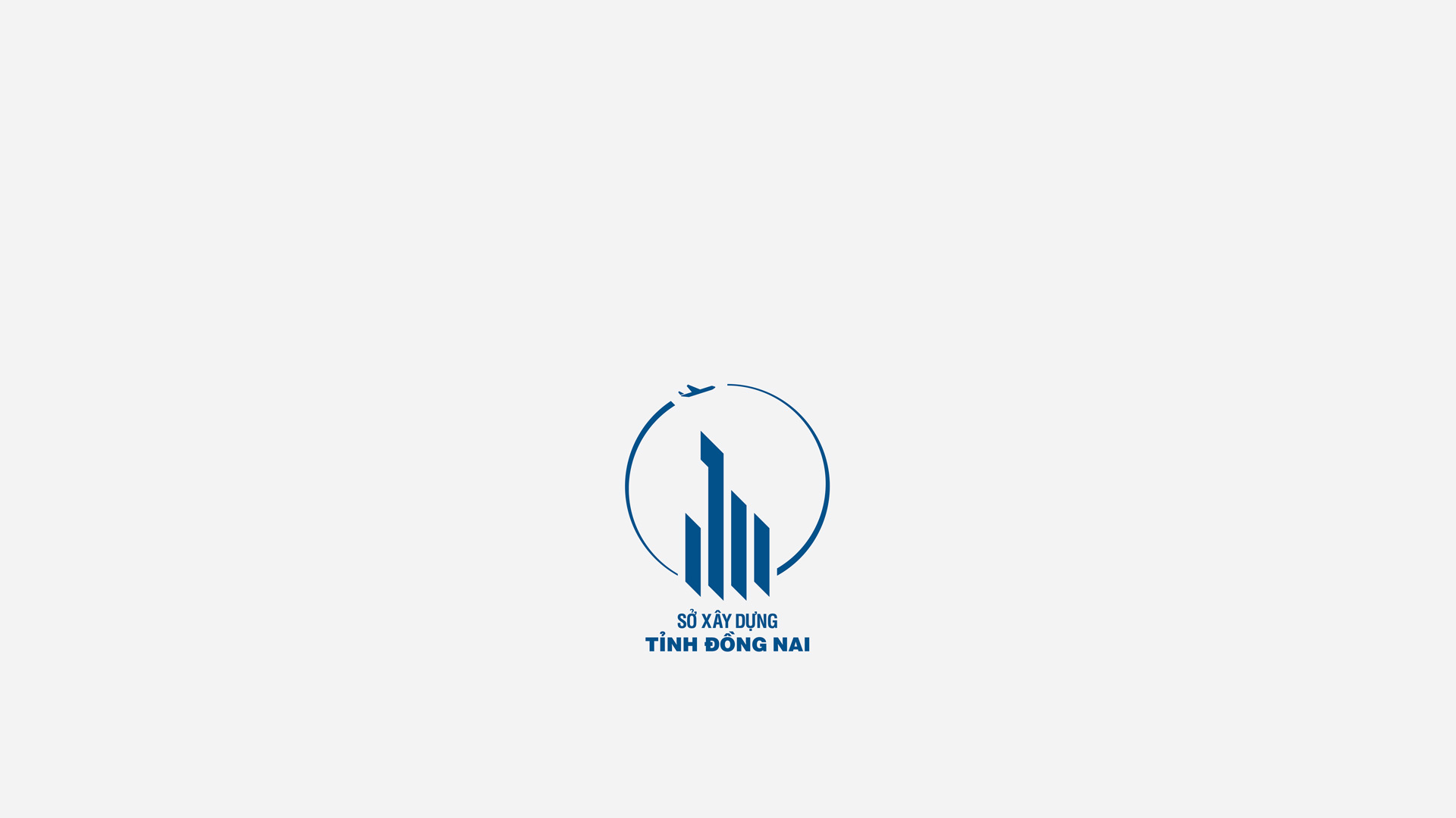
Drawing on the characteristics of the urban planning and construction sector, the design conveys both professional expertise and Dong Nai’s spirit of development. Its central concept integrates the province’s abbreviation with imagery of modern buildings, forming a cohesive visual structure that connects the locality with the Department’s field of activity.
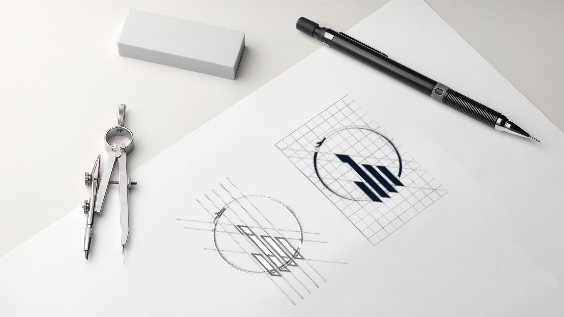
Within the overall composition, architectural imagery is distilled into concise geometric forms. Rather than depicting a specific building, the lines abstract the process of shaping space and defining the urban landscape. This approach brings architectural form-making into logo design while preserving clarity and easy recognition.
The surrounding circle symbolizes connection and exchange, reflecting Dong Nai’s relationships with neighboring localities, regional economic zones, and international partners. Within the overall logo, this element creates visual unity while extending the narrative from construction activity to the province’s role in regional integration and development.
The airplane motif evokes Long Thanh International Airport, a central image in the design concept. Beyond its reference to transport infrastructure and connectivity, the symbol conveys Dong Nai’s aspiration to take flight and its forward-looking vision. When combined with the architectural forms and surrounding circle, the airplane contributes to the sense of movement across the entire logo.
Deep sky blue was selected as the primary color, evoking the construction sector while creating a modern and refined impression. The design emphasizes clear, easily recognizable lines and flexible application across a wide range of materials, surfaces, and communication channels. While the color scheme may be adapted to different conditions of use, the underlying form remains the core element for maintaining consistency across the visual identity system.
Architect Tran Minh Tuyen approaches logo design as the process of distilling an organization’s identity and development vision into a distinctive visual mark. The value of the design lies in its balance of meaning, form, and application: a logo that carries a strong professional character, is rooted in its local context, and looks toward the future.