
Construction Newspaper Logo: Preserving Heritage, Connecting the Future
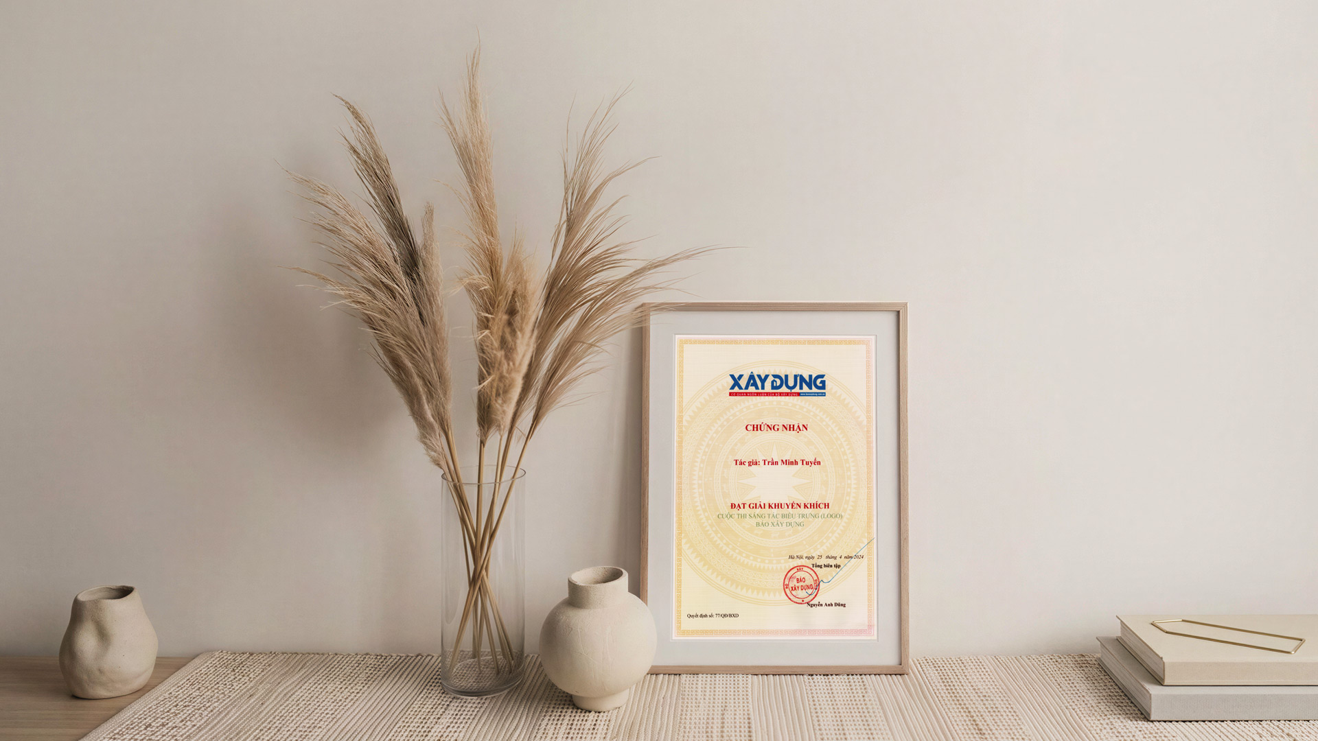
The logo of Construction Newspaper, designed by Architect Tran Minh Tuyen, received an Encouragement Prize in the logo design competition organized by the Editorial Board. The award was presented on April 25, 2024. Centered on the name “Xây dựng” (Construction), the design combines typography with imagery associated with journalism and the construction sector, reflecting a spirit of both heritage and innovation.
A Bridge Between Journalism and the Building Industry
The concept originates from the close relationship between the two fields that define the newspaper’s identity: journalism and the construction sector. The logo conveys the role of a press organization in informing society and fostering connection, while also evoking the constructive spirit and solid technical foundation of the construction industry.
The design deliberately inherits the spirit and color palette of its predecessor while developing its visual language in a more modern and minimalist direction. Innovation is embedded within a continuum of existing values, preserving familiar recognition for generations of readers.
A Focal Point of Visual Expression
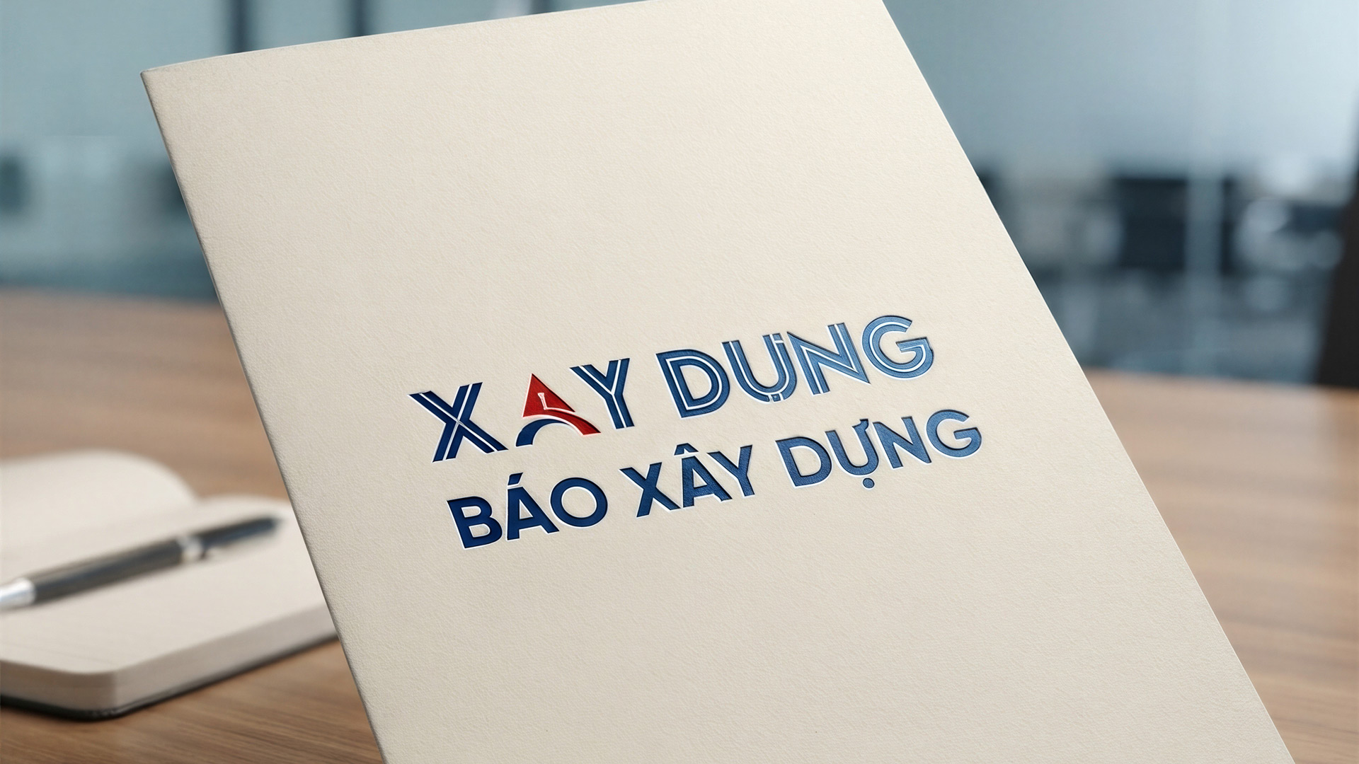
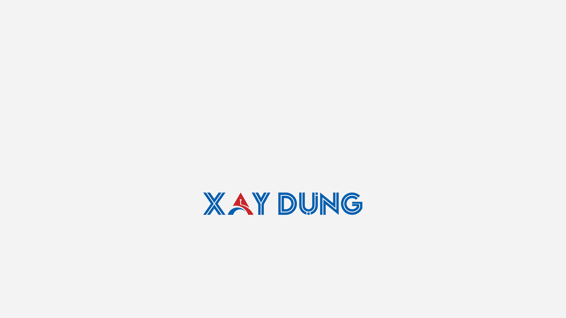
The artistic highlight of the design centers on the letter “Â,” where the designer skillfully integrates layers of sector-specific symbolism into the letterform. The traditional pen nib is rendered in visual harmony with a modern computer cursor. This pairing expresses the continuous evolution of Construction Newspaper, from traditional print journalism to a multi-platform digital news environment. Positioned at the center, the pen nib serves as a guiding compass, reinforcing the newspaper’s core values of professional ethics and integrity.
The arched strokes and horizontal bar of the letter “” are stylized into images of technical infrastructure: bridges, roads, and underpasses. This concept represents not only the construction sector but also serves as a metaphor for the flow of information, connecting regions, linking Vietnam with the world, and bridging the past, present, and future.
Heritage and Dynamic Growth
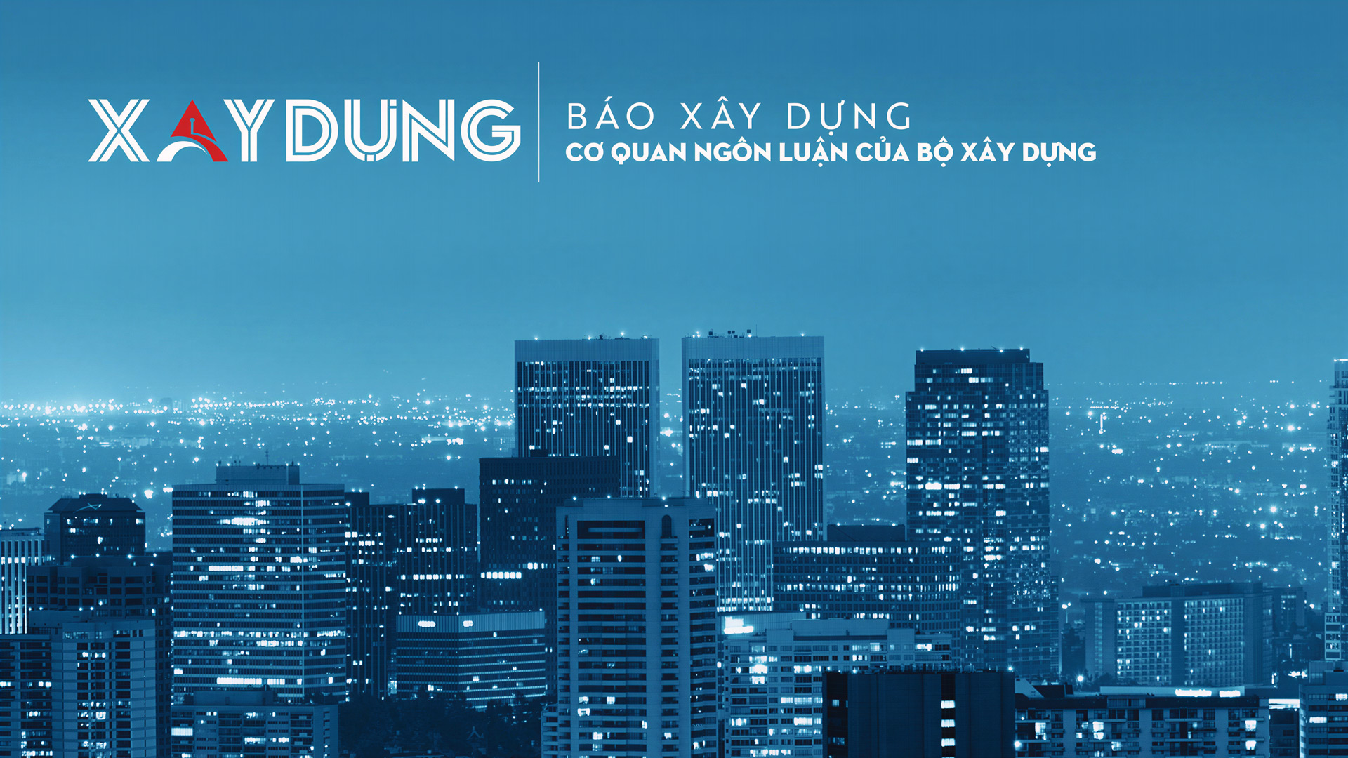
The primary blue is developed from the heritage tone of the predecessor logo, conveying a sense of authority, trust, and the sustainable character associated with the construction industry. Retaining this color palette preserves continuity within the visual identity system.
Against the calm blue background, the red pen nib creates a strong visual focal point. Red expresses the courage, passion, and ambition of the newspaper’s journalists. The contrast between the two colors establishes a clear visual hierarchy, ensuring that the logo remains both balanced and distinctive.
Inheriting to Reach Further
Through the Construction Newspaper logo, Architect Tran Minh Tuyen harnesses the expressive potential of typography to connect the publication’s name, professional identity, and values. From the solid letterform structure to the sharp pen-nib focal point, every element converges toward a unified message: Preserving the Foundation - Expanding Connections - Looking to the Future.